
As someone who is really into fonts, I know that most people don’t share my passion — but I genuinely think that anyone who cares at all about typography will have some interest in what Google announced on Thursday. If you’ve ever used anything made by Google, you’ve seen Roboto. Now, Google’s introducing something called Roboto Flex. As the name implies, it’s a version of its famous font that you can tweak and customize in a ton of ways.
I can sense I might be about to lose a lot of people, so let’s try this: here’s a gif showing all the customizable parameters Roboto Flex has. There’s no trickery going on — I’m not changing a raster image with Photoshop or anything. Everything you see is built into the font itself and can be changed as easily as the font size.
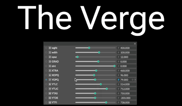
Pretty cool, right? (If you just said “no” to your computer screen, you have my permission to leave now. This isn’t going to get any more interesting for you.)
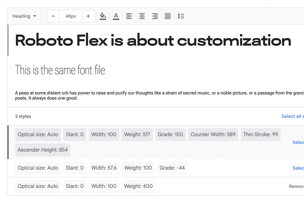
Basically, what’s happening is that Roboto Flex is a “variable font,” meaning that you don’t have to manually load separate files to make changes to its weight, slant, or other variables. Flex goes further than just the basic changes, though; Google says there are 12 different ways you can tweak it, including changing its width, stroke thickness, and even the heights of ascending and descending stems (like are found on the letters “d” and “p,” respectively).
:format(webp):no_upscale()/cdn.vox-cdn.com/uploads/chorus_asset/file/23442915/unnamed_2.jpg)
These types of fonts have been around for a while — even Roboto Flex has been publicly in the works for a year or so, but it’s cool to see that Google’s making it readily available to anyone that wants to use it.
Roboto Flex also has a few other interesting features that aren’t directly related to making it look cool. In its blog post, Google says it’s put a lot of balancing into the font to make sure that it looks right at specific sizes, so the text will look properly bold or thin, whether it’s taking up an entire page or is just a teeny footnote. Google’s announcement also gets into how the font’s designers (a studio called Font Bureau) made sure tiny details were right. Apparently, the circles used in the percent symbol are proportionally the same as the numeral 0. That is some hardcore font nerdery, and I love it.
What this all means in practice is that designers have a lot of control over how their text ends up looking without having to do a lot of work (assuming the application they’re working with actually supports variable fonts). It’s also great for web designers who want a standard-looking font that they can tweak to make sure their headings and titles stand out, both from the rest of the text on the page and from other websites. It also doesn’t hurt that, because it’s a Google Font, you can add it to your site with one or two lines of code.
:format(webp):no_upscale()/cdn.vox-cdn.com/uploads/chorus_asset/file/23443213/Screen_Shot_2022_05_06_at_12.40.09.png)
Plus… look, this may be going out on a limb here, but I couldn’t help but think about all the fun UI things you could do if this were the font on, say, a phone with a folding display. You know, like the one Google’s supposedly working on? It’s easy to imagine visual tricks like the font stretching while you fold open your phone or where text keeps the same proportions when you go from the small front screen to the larger inside screen. That type of thing would be much easier to implement if you’re working with a flexible font and would be really fun to see in practice (and Google’s all about fun in Android now, right?)
This isn’t the only interesting font Google’s made recently. It also announced a seriffed version of Roboto, which would seem like heresy if it didn’t actually look really nice, and it even brought back the beloved blobs in its Noto Emoji font. It’s not the only one playing around with variable fonts either — Apple’s SF Pro, which is used as the default font on pretty much all of its devices, supports variable optical sizes, and Microsoft’s programmer-focused Cascadia Code supports variable weights.